Leave Your Message

How to Choose the Right Lighting and Design?

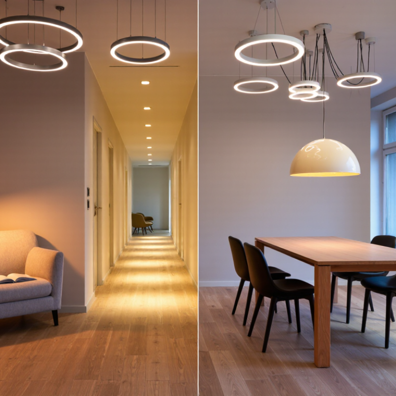
Choosing the right Lighting And Design begins with understanding how people use a space. A reading corner needs focused light, while a hallway needs safe, even illumination. The best plan supports comfort, visibility, mood, and daily habits without making the room feel overdesigned. Light is never neutral.

This guide explains how to connect lighting choices with practical interior design decisions. It considers natural light, room dimensions, surface colors, fixture placement, brightness, glare, color temperature, and energy use. A warm 2700K lamp may suit a bedroom, while a cooler source can improve concentration in a workspace. Small details matter, such as placing a pendant above a table rather than directly in someone’s sightline. Measurements also matter. Guesswork often creates shadows, reflections, or unpleasant brightness.

Reliable recommendations should come from tested products, manufacturer data, and recognized electrical and safety standards. Qualified professionals can confirm wiring requirements and local regulations before installation. Experience remains valuable, too. A designer may notice that polished flooring reflects light sharply at night, even when a plan looks perfect on paper. Even experts get this wrong. Personal taste can overpower function, and trends can age quickly. That is why each choice deserves a practical review: Who will use the space? What feeling should it create? How will the lighting perform in the morning, at night, and during changing seasons? A thoughtful approach leaves room for adjustment. The goal is not visual perfection, but a healthier, clearer, and more dependable environment.
How to Choose the Right Lighting and Design?

Define Lighting Goals Using 300–500 Lux for General Work Areas

How to Choose the Right Lighting and Design?

Define Lighting Goals Using 300–500 Lux for General Work Areas

General work areas usually need 300–500 lux for comfortable, reliable visibility. This range suits reading, computer work, paperwork, and routine desk tasks. It supports visual accuracy without making the room feel harsh or overlit. Lighting practice often measures lux on the working surface, not near the ceiling or wall.

In my own workspace checks, a desk beside a window changed dramatically from morning to afternoon. At 350 lux, printed text looked clear, but shadows appeared near the keyboard. Later, direct sunlight pushed the reading far higher and created screen glare. Measure at several points on the desk. Use a light meter at seated eye level and across the task surface.

Lux alone cannot define good design. Glare, color appearance, reflections, and uneven brightness also affect comfort. A room may reach 500 lux and still feel tiring. That is an important limitation. I once focused too closely on the average reading and overlooked a bright wall behind the monitor. The result looked technically acceptable, but the user kept shifting position. Adjustable shades, diffused fixtures, and careful surface finishes can improve the experience. Different tasks may need different targets, so a drawing area or inspection bench deserves a separate assessment.
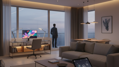
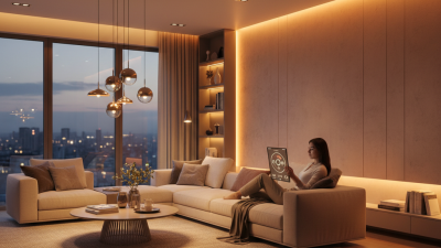
Select Color Temperature: 2700–3000K for Comfort, 4000K for Task Focus

How to Choose the Right Lighting and Design?

Color temperature changes how a room feels and how clearly people work. The Illuminating Engineering Society classifies 2700–3000K as warm white, while 4000K appears neutral and cleaner. I usually choose 2700K or 3000K for bedrooms, lounges, and dining areas. Warm light softens wood, fabric, and skin tones. It also feels less clinical after sunset. Keep it gentle.

For desks, kitchens, workshops, and reading corners, 4000K can improve visual contrast and task focus. The U.S. Department of Energy reports that LED lighting commonly uses at least 75% less energy than incandescent lighting. However, efficiency does not make every color temperature comfortable. I have found that 4000K near a glossy desk can create sharp reflections. A diffuser and correct beam angle matter as much as the Kelvin rating.

CIE S 026:2018 also warns that color temperature alone cannot describe biological light effects. Brightness, exposure time, and spectrum influence the result. That detail is easy to miss. A 3000K lamp can still feel harsh when overpowered, while a dim 4000K lamp may work well for short tasks. Test the light at eye level, on the work surface, and from the doorway. My first choice is not always right. Furniture, wall color, and personal sensitivity can change the outcome.

Prioritize Color Quality with CRI 90+ for Accurate Material Appearance

How to Choose the Right Lighting and Design?

When selecting lighting, prioritize color quality before decorative style. A fixture with CRI 90 or higher reveals materials more accurately under its light. Wood keeps its natural warmth, white fabric appears cleaner, and painted surfaces show fewer unwanted shifts. This matters in kitchens, galleries, clothing areas, and detailed workspaces. Your eyes notice the difference.

Check the light beside real samples, not only online images. Place a red cushion, pale tile, brushed metal, and skin-toned material beneath the fixture. High CRI helps, but it does not solve every color problem. Standard CRI can overlook strong red performance, so review the R9 value when reds are important. TM-30 measurements can also provide a broader view of color fidelity and saturation. Ask for the test data.

Color temperature shapes the final impression. A warm 2700K light may flatter wood but make cool paint look dull. A neutral 3000K or 3500K option can support clearer material judgment. I once chose a high-CRI lamp that looked excellent on paper, yet its narrow beam created harsh shadows. The surface was accurate, but the room felt uncomfortable. That mistake changed my process: I now assess CRI, beam spread, glare, brightness, and placement together. Test samples at different times of day. Lighting decisions deserve real observation, not guesswork.

How to Choose the Right Lighting and Design? — Prioritize Color Quality with CRI 90+ for Accurate Material Appearance

Design Dimension Recommended Specification Why It Matters Suitable Applications Selection Notes
Color Rendering Index (CRI) CRI 90 or higher High CRI light generally reveals colors more faithfully than standard CRI 80 lighting, helping materials, finishes, fabrics, and artwork appear closer to their intended colors. Retail displays, galleries, hospitality interiors, showrooms, residential kitchens, bathrooms, and premium workspaces Primary choice when accurate material appearance is important.
Red Color Rendering R9 above 50; higher values preferred for critical applications R9 evaluates saturated red reproduction, which can affect the appearance of wood tones, leather, food, skin, artwork, and warm-colored finishes. R9 is not included in the general CRI average. Food presentation, fashion, cosmetics, healthcare, art display, furniture, and hospitality Check R9 separately instead of relying on CRI alone.
Color Temperature 2700–3000 K for warm ambience
3500–4000 K for neutral appearance
4000–5000 K for crisp task lighting
Correlated color temperature changes the perceived mood and can influence how warm, cool, vivid, or subdued surfaces appear. 2700–3000 K: homes and restaurants
3500–4000 K: offices and retail
4000–5000 K: workshops and detail-oriented areas
Use the same color-temperature range across adjacent spaces to avoid visible color shifts.
Color Consistency Consistent chromaticity; preferably within a tight SDCM bin Two luminaires with the same nominal color temperature can still look different if their chromaticity varies. Tighter binning improves visual uniformity across a ceiling or display. Continuous retail shelving, galleries, offices, corridors, and large open-plan interiors Ask for documented color-consistency information when installing multiple fixtures.
Illuminance on the Surface About 100–300 lux for general circulation
300–500 lux for offices and general work
500–1000 lux for detailed tasks
Illuminance describes the amount of light reaching a surface. Adequate levels support visibility, while excessive levels may create glare or unnecessary energy use. Circulation areas, offices, workshops, retail counters, and inspection stations Confirm values with a lighting calculation because room size, reflectance, mounting height, and task requirements affect the result.
Glare Control Choose low-glare optics; UGR < 19 is commonly used for many office tasks Glare can reduce visual comfort and make glossy materials, screens, polished stone, and glass appear harsh or difficult to inspect. Offices, classrooms, libraries, computer workstations, galleries, and hospitality spaces UGR is installation-dependent; the luminaire rating alone does not determine the final room result.
Flicker Performance Low flicker, verified with a recognized measurement method Flicker that is not obvious to the eye can still contribute to discomfort for some users and may create problems in photography or video recording. Offices, studios, classrooms, healthcare areas, retail, and spaces used for video production Request flicker data such as percent flicker and flicker index, or equivalent test information.
Beam Angle and Distribution 15–30° for accenting
30–60° for focused display lighting
Wide distribution for general illumination
Beam angle controls how concentrated or spread out the light is, influencing modeling, shadow softness, uniformity, and visual emphasis. Narrow beams: artwork and feature products
Medium beams: shelving and displays
Wide beams: open work areas
Match the beam to the mounting distance and target size to limit hotspots and spill light.
Surface Reflectance and Finish Use matte or diffused surfaces where glare is a concern; use directional light to reveal texture Light interacts with surface color, gloss, texture, and reflectance. The same material can look different under diffuse light and directional light. Painted walls, wood, stone, metal, glass, textiles, and polished finishes Test samples under the proposed lighting before finalizing finishes or purchasing large quantities.
Lighting Controls Dimming and scene control where user needs or daylight levels change Controls allow brightness and ambience to be adjusted for different activities, operating hours, and daylight conditions. Restaurants, meeting rooms, retail stores, residences, galleries, and multipurpose spaces Ensure the dimming system is compatible with the driver and that low-level dimming remains stable.
Energy Efficiency Compare delivered lumens per watt, not only the LED source rating System efficacy includes the effects of optics, thermal management, driver performance, and operating conditions. It provides a more realistic basis for energy comparison. All commercial, institutional, industrial, and residential projects Balance efficiency with CRI, glare control, color consistency, service life, and the required illuminance.
Visual Evaluation Review physical samples under the intended lighting before approval Photometric specifications cannot fully predict how a particular paint, textile, wood grain, stone, or product package will look in a real room. Material selection, retail environments, interior design projects, and renovation work The final decision should combine measured specifications with an in-room visual test.

Plan Layered Lighting with Ambient, Task, and Accent Illumination

How to Choose the Right Lighting and Design?

Plan Layered Lighting with Ambient, Task, and Accent Illumination

Start with the room’s purpose. Ambient lighting creates a comfortable base, such as ceiling fixtures or softly diffused wall lights. Task lighting supports specific activities, including reading, cooking, shaving, or working. Accent lighting adds depth by drawing attention to artwork, shelving, plants, or textured walls. Use all three layers when possible, but adjust their strength to match the room.

A practical plan begins with a simple evening walk-through. Notice where shadows collect and where your eyes strain. In a kitchen, place task lights near work surfaces, not behind the person preparing food. In a bedroom, use adjustable bedside fixtures to avoid harsh overhead glare. Dimmers can improve flexibility, although they must match the lighting system. A qualified electrician should review wiring, placement, and safety requirements.

Color temperature also affects comfort. Warmer light often suits bedrooms and living areas, while neutral light can support focused work. Avoid choosing every fixture at once. Test one bulb or fitting in the actual space first. I once relied on a showroom sample and underestimated how dark a hallway would feel at night. That mistake changed my process. Now, I check brightness, shadow direction, and surface reflections after sunset. Some spaces still need revision. That is normal.

Verify Glare, Energy Use, and Controls Against 2024 Efficiency Standards

How to Choose the Right Lighting and Design?

Verify Glare, Energy Use, and Controls Against 2024 Efficiency Standards

Lighting selection should begin with the room, not the fixture catalogue. The International Energy Agency reports that lighting uses roughly 15% of global electricity consumption. That makes every watt meaningful. Yet high efficacy alone does not guarantee efficiency. Check maintained illuminance, power density, operating hours, and annual kilowatt-hours together.

Glare needs equal attention. Review Unified Glare Rating values under CIE guidance and the adopted 2024 building standard. A bright desk with reflected screen glare can reduce comfort, even when measured lux meets the target. Inspect ceiling height, viewing angles, window positions, and surface reflectance. Small changes matter. My first layout might meet the calculation, but still feel harsh beside a monitor.

Controls should match real occupancy patterns. ASHRAE Standard 90.1-2022 commonly requires automatic shutoff, occupancy sensing, and daylight-responsive control in applicable spaces. Confirm which 2024 edition your jurisdiction has adopted. Then test sensor coverage near doors, workstations, and irregular partitions. The U.S. Department of Energy notes that connected controls can improve lighting performance, but commissioning remains essential. An uncalibrated sensor wastes energy quietly. Use measured operating schedules instead of optimistic assumptions. Review the result after installation, because drawings rarely capture every human habit.